The Characteristics of Text and Display Sizes in 16th Century Flemish Roman Type comparative analyses of seven types cut by Hendrik Van Den Keere in the period 1570 – 1580
Article Sidebar
Published:
2021-09-28
Keywords:
letterform,
font design,
research methods,
legibility,
readability,
typography
Main Article Content
Abstract
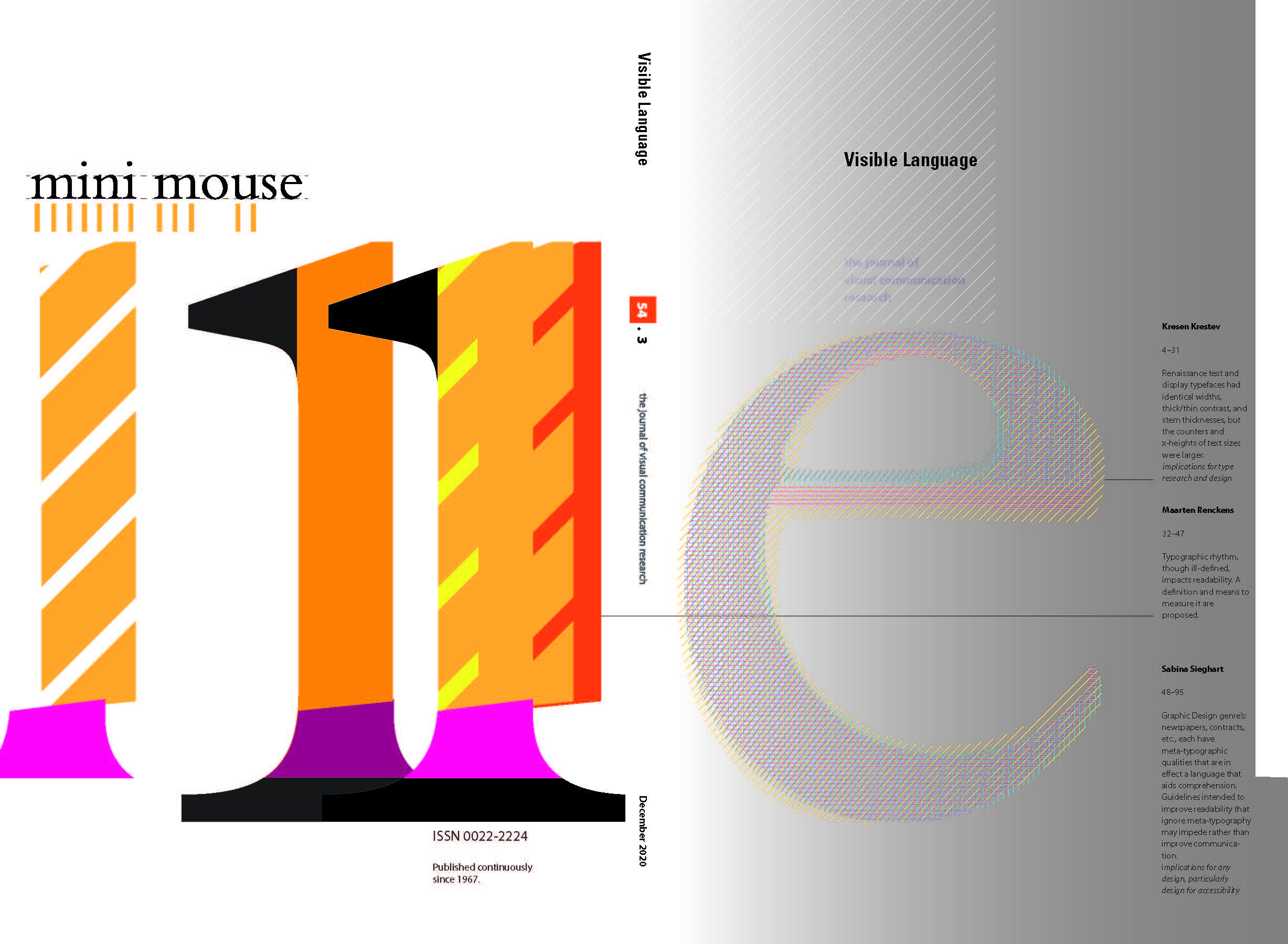
This project attempts to bring more insight to the approach of designing type for different sizes in western Europe during 16th century by making a comparative analysis of seven different sizes of roman type (three display and four text sizes) cut for the print-house of Christophe Plantin in Antwerp by the Flemish punch-cutter Hendrik van den Keere in the period between 1570 - 1580. The aim of the comparison is to gain knowledge about the historical design of small/text and large/display type sizes that might be useful in the production of type today.
Article Details
Section
Research Article