Making Cancer Surveillance Data More Accessible for the Public Through Dataspark
Article Sidebar
Published:
2013-08-01
Main Article Content
Abstract
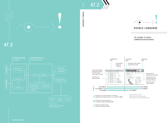
This paper describes findings from an experiment to determine whether visual design could enhance the effectiveness of the presentation of cancer surveillance data online. The research team included designers who created an interface called Dataspark ( DS ) for California citizens to see incidence rates for colorectal cancer in the state. The design of the display used principles of relative scale, color, shape, and arrangement. In a randomized experiment, this interface was compared to two displays that are hosted by established cancer organizations but do not use principles of scale, color, shape, and arrangement in the same way. Approximately 550 California citizens participated in the experiment, during which they were assigned at random to use one of the three displays and then asked questions about understanding, ease of use, engagement and personal relevance. Results showed that the Dataspark display was significantly more effective in helping participants understand the data and explore the interface. User engagement and personal relevance were modest for all three displays. This paper analyzes the results and introduces some strategies to address engagement and personal relevance in future work.
Article Details
Section
Research Article