Effect of Typeface Complexity on Automatic Whole-Word Reading Processes
Article Sidebar
Main Article Content
Abstract
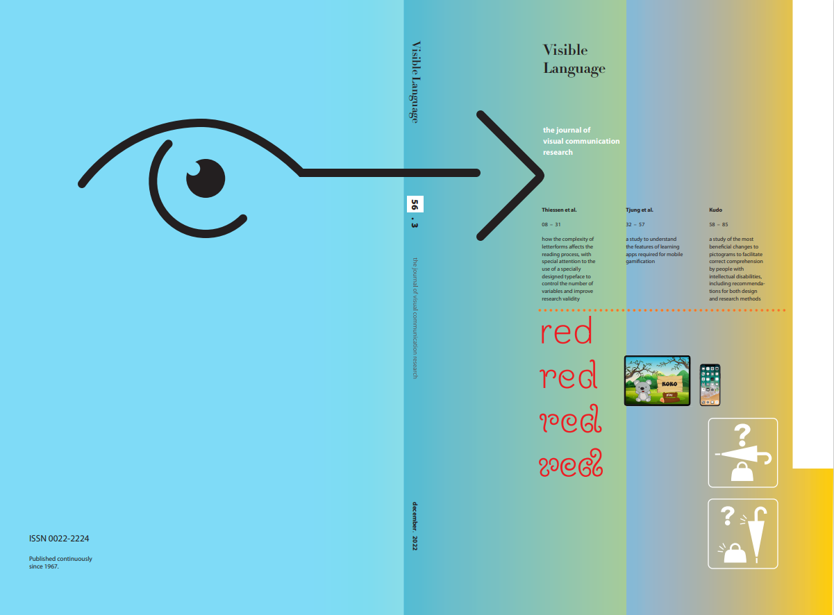
Visually complex typefaces require more cognitive effort to process, which can impact reading efficiency, and have been associated with disfluency effects. Since our environments may include an increasing range of demand-ing reading scenarios—to which we are expected to respond, sometimes with speed and accuracy—it is important to develop an understanding of how reading proficiency may be affected as a result. With a focus on how automatic reading processes may be affected, this study explores the impact of typeface complexity, determined by stroke length and system-atically measured using perimetric complexity, by using the well-known Stroop Color and Word Test. We show that automatic whole-word reading can be negatively affected by typefaces with extremely complex features, but that moderately complex typefaces have little effect. This suggests that hard-to-read typefaces do impair word reading (i.e., they are disfluent) but that skilled readers are able to tolerate a high degree of complexity. It also highlights the utility of cognitive tests for identifying typefaces that are dif-ficult to read.