Letterforms in Photo-typography
Article Sidebar
Published:
1970-10-01
Main Article Content
Abstract
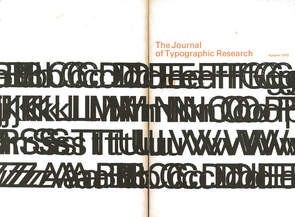
The accelerated flow of information in today’s world demands that our typography be of maximum utility and comfort to the reader. There is a trend toward universal usage of fewer text faces and toward larger sizes of reader typefaces. Differentiation must be made between material designed for sustained and for reference reading. The two basic photo-composition generation systems—projective exposure and CRT generated—are compared.
Article Details
Section
Research Article