The Influence of Serifs on 'h' and 'i': Useful Knowledge from Design-led Scientific Research
Article Sidebar
Published:
2013-11-01
Main Article Content
Abstract
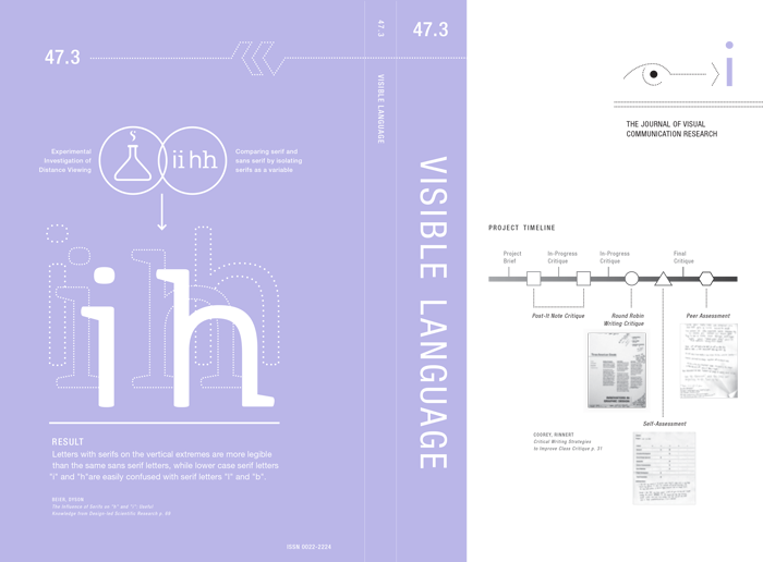
The typographical naivety of much scientific legibility research has caused designers to question the value of the research and the results. Examining the reasons underlying this questioning, the paper discusses the importance of designers being more accepting of scientific findings, and why legibility investigations have value. To demonstrate how typographic knowledge can be incorporated into the design of studies to increase their validity, the paper reports on a new investigation into the role of serifs when viewed at a distance. The experiment looks into the identification of the lowercase letters 'j', 'i', 'l', 'b', 'h', 'n', 'u', and 'a' in isolation. All of the letters originate in the same typeface and are presented in one version with serifs and one version without serifs. Although the experiment found no overall legibility difference between the sans serif and the serif versions, the study showed that letters with serifs placed on the vertical extremes were more legible at a distance than the same letters in a sans serif. These findings can therefore provide specific guidance on the design of individual letters and demonstrate the product of collaboration between designer and scientist on the planning, implementation, and analysis of the study.
Article Details
Section
Research Article